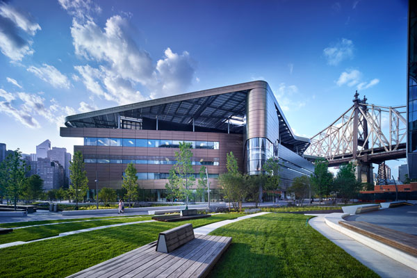
From the November issue: All New Yorkers should welcome the new Cornell Tech campus, which just opened its first buildings on Roosevelt Island. This ambitious project will only strengthen New York’s place in the world of tech development and will rival anything on the West Coast.
We can all thank Michael Bloomberg, who pushed the project while he was mayor and has since followed up with a $100 million donation to bankroll the campus’s epicenter: The Emma and Georgina Bloomberg Center. But while many great achievements will come out of this new tech hive, unfortunately great architecture is not likely to be one of them. That’s judging from the pallid master plan, conceived by Colin Koop of Skidmore, Owings & Merrill, and from the first three buildings at the project.
Those buildings are the Bloomberg Center and the Bridge at Cornell Tech — which have both opened — as well as the nearly complete House at Cornell Tech, a residential building for students and faculty. Ground will soon break on the Verizon Executive Ed Center and the Graduate Roosevelt Island Hotel, which have both been designed by the international firm Snøhetta.
When complete in 2043, the 12-acre Cornell Tech engineering campus — a collaboration between Cornell University and Technion-Israel Institute of Technology — will have 10 buildings and 2.5 acres of open space, stretching across the island with sweeping views of Queens and Manhattan. It will be, according to its website, one of the planet’s most energy-efficient campuses.
But architecturally, the problems with Cornell Tech are twofold: The first is the clamorous diversity of the overall architecture, and the second is the design quality of each building.
The project presented a perfect occasion to hire a single architect — say, Renzo Piano, who designed much of Columbia University’s new Harlem campus, or Stephen Holl, who designed the Campbell Sports Center in Upper Manhattan. The absolute dream would have been Santiago Calatrava, who surpasses all other living architects and who could have created a marvel out of a group of buildings, as he did with his City of Arts and Sciences in Valencia, Spain.
 As it stands, Cornell Tech has enlisted some fairly middling talents alongside star architects. For starters, there’s no cohesion among the first three buildings, other than that they all exhibit some degree of the formulaic asymmetries of the Deconstructivist style that is now the official language of money and power.
The Bloomberg Center is the work of Thom Mayne of the Pritzker Prize-winning firm Morphosis Architects. The building’s hulking bronze mass recalls the firm’s dark and bulky Cooper Union building, which opened in 2009 on the Bowery — though it’s a slightly improved version, avoiding the cheap feeling that the earlier building exudes.
This building is crowned by a detached roof, referred to as “swooping lily pad-shaped.” According to the project’s website, the rooftop includes “geothermal heating and cooling systems” that are part of its passive energy-efficient design. But from a design perspective it looks superfluous.
The building consists of four stories of intermittent ribbon windows set into a metallic cladding that’s textured with thousands of circular openings. But on a recent visit, these coin-sized adornments appeared too small to save large portions of the east and west facades from undifferentiated tedium. In those lengthy passages, it almost seems like the architect ran out of Deconstuctivist gimmickry.
Meanwhile, the Bridge — designed by the Manhattan-based firm Weiss/Manfredi and partially developed by Forest City Ratner Companies — is slightly more palatable. The building, meant to facilitate or “bridge” interaction between researchers and entrepreneurs looking to invest in startups, employs a glass cladding that’s less irksome than the cladding of the Bloomberg Center.
The design, which was planned around the central staircase, was meant to foster openness, and its roof is meant to offset the energy consumption of the Bloomberg Center.
Along its main façade, the structure — designed by the firm’s namesake architects, Marion Weiss and Michael Manfredi — reads as three irregular masses, two of which lurch forward flanking a receding central mass. While the irregularities of the structure and the occasional fritted glass are not subtle, they are easy to overlook and add little to the design.
All of that brings us to the House, advertised as the first residential high-rise tower to be built to “passive” standards. While that environment achievement is impressive, the building’s design is less so. Designed by Handel Architects, the building is the most conventional of the three. The tall white structure, which has ribbon windows along its main structure and a slightly detached secondary mass, looks like a midrange chain hotel in Midtown. Handel has designed some good buildings, Including 170 Amsterdam Avenue, but its clumsy 200 West 72nd Street is, in this critic’s view, a more typical representation of its work.
Meanwhile, the 360,000-square-foot Verizon conference center and the 196-room Graduate Roosevelt Island Hotel are scheduled to open in 2019. In the renderings, these two look a little more promising. And on another positive note, the project’s landscaping has been well designed by James Corner Field Operations.
But the main problem with the overall architecture can be summed up in the pale public spaces and cafés of the Bloomberg Center and the Bridge. Despite their restless curves, there’s nothing remarkable about them. Ultimately, they look exactly as you would expect a well-endowed postindustrial institution to look. And while the buildings will likely be home to a tech brain trust that will be hard to rival, on the design front, mediocrity has seemingly won out.
