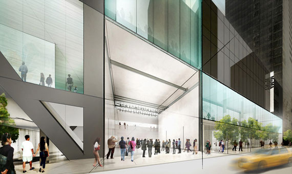
Any architect who works for the Museum of Modern Art — whose renowned 81-year-old department of architecture and design claims implicitly to be the conscience of the architectural profession in the city, if not the nation and beyond — has an unenviable task. Any new building campaign is apt to destroy or compromise some element of recent architectural history. At the same time, it must compete with a half dozen previous building campaigns, which make it virtually impossible to harmonize one element with another, let alone every element with all the others.
If the Japanese architect Yoshio Tanaguchi’s massive expansion of MoMA in 2004 achieved anything at all, it was to harmonize most of the museum’s disparate parts. And yet, although the museum unveiled his new complex with great pride a decade ago, Director Glenn Lowry, who was responsible for that expansion, was quoted in the New York Times as somewhat sheepishly claiming that, “You build something and you start to realize some things work well, some things are O.K., and some things can be improved.”
And so yesterday, the museum announced certain key additions, subtractions and modifications to the Kremlin-like fortress that continues to Grow On 53rd Street between Fifth and Sixth Avenues.
True, MoMA has far too much traffic even for its expanded form: it receives half as many visitors as the Metropolitan Museum of Art, yet has only one eighth the space. Also, its severe and darksome lobby, which extends from 53rd to 54th streets, feels distinctly unwelcoming, even menacing.
In the interests of expanding the museum and making it more inviting to the city at large, MoMA has called in the capable firm of Diller Scofidio + Renfro, which has wrought such notable improvements upon the campus of Lincoln Center.
Diller Scofidio + Renfro will have an easier time of it here, since the existing buildings are more compatible with their style than the travertine palaces ten blocks north. According to the renderings, and aside from a few bold diagonals in the entrance, the architects will respect the strict rectilinear form of MoMA’s overall design, while playing their usual games with radical recession into depth in the new lobby, as well as with steep and intentionally uncomfortable stairways. The result will be a more coherent and open, lighter and more unified façade along the main entrance of 53rd Street.
Perhaps the architects’ boldest innovation will be the daring decision to open up the museum’s famed sculpture garden, to allow the public free and direct access from the street. Nothing in Tanaguchi’s design communicates more eloquently the divide between museum-goers (who can afford the $25 admission) and the rest of the city than that high-walled barrier, which is slatted just enough for pedestrians outside to catch a glimpse of the happy few. Now that barrier will be breached along 54th Street with a sheer glass canopy that recalls the architects’ work and Lincoln Center, even as it pays homage to Yanaguchi’s strict geometric idiom.
But, as MoMA has now confirmed, the expansion will result in the destruction of Tod Williams and Billy Tsien’s abandoned American Folk Art Museum, whose threatened demise caused such hand-wringing last spring. After considerable public outcry, not least from the architects themselves, Lowry announced back then that the building’s fate would be reconsidered. Now, after a decent interval and in consultation with the new architects, he has returned to his original intention to tear it down. As I stated at the time and as I continue to believe, this is the only right decision. The building was not functional and the design, from a purely aesthetic consideration, was substandard.
