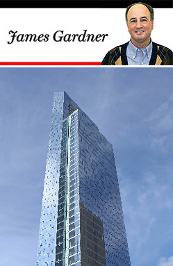
 The Aire at 200 West 67th Street
Amsterdam Avenue looks like a war-zone these days. Quite aside from the newly completed building, the Corner, at 200 West 72nd Street, there is an almost uninterrupted catenary of scaffolding sheds stretching from 70th Street all the way to Lincoln Center. One of the new developments that has topped out at 42 stories is the nearly complete Aire, developed by A & R Kalimian Realty and designed by Handel Architects, at 200 West 67th Street at Amsterdam Avenue.
Aire, which rises over what used to be an American Red Cross blood donation center, is divided into two parts, the more visible being the glass and steel tower, which contains 310 rental units ranging from studios to three-bedrooms. The other part, a four-story structure clad in rose-colored stone, with passages of steel-encased ribbon windows, will contain retail space and offices.
Handel Architects, which designed this new development, also designed the Corner, a few blocks north. In neither case has the firm distinguished itself, at least as far as concerns the average New York who has the misfortune to walk by the exterior, rather than the good fortune to inhabit the fairly lavishly appointed interior spaces.
True, this newer project isn’t exactly ugly, as, you could argue the Corner is. But to See The Building From Broadway And 72nd Street, looking south, is to encounter what looks like an uninflected monolith of almost unrelieved dullness.
Predictably, the renderings are conceived from the choicest and most viable angles — but on the ground, such vantage points are hard to come by. There is a little more oomph to the southern side, looking north, with its edges faceted in a tame variation on the regnant deconstructivist style.
But just because this southern side isn’t as boring as the northern one does not make the building interesting enough. It should also be said that the two parts of the development, the tall, perpendicular shaft and the horizontal retail area, are conceived in very different styles that do not accord well with one another.
With the destruction of that modest but not inelegant five-story modernist American Red Cross blood donation center building, there was reason to hope that something more distinctive would take its place. As it is, an opportunity has been lost.
James Gardner, formerly the architecture critic of the New York Sun, writes on the visual arts for several publications.