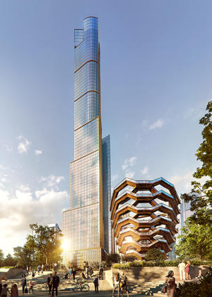
Now that 35 Hudson Yards is sufficiently underway, we can safely compare the once-abstract design to the reality rising out of the ground.
Like all the buildings at the $25 billion Hudson Yards development, it is a one-off structure, employing many of the devices that make up the regularly (and, perhaps overly) used Deconstructivist style.
This new building — which was designed by David Childs of Skidmore, Owings & Merrill — exploits a certain visual ambiguity. Located at Eleventh Avenue and West 30th Street, the building was initially designed in 2011 as a cylinder but soon evolved into its present 92-story irregular rectangle. Depending upon the angle it’s viewed from, it can now look like either shape. The 1,000-foot-plus tower perfectly captures one of the oddities playing out in contemporary architecture in Manhattan — that there is no longer an important stylistic distinction between office and residential towers.
This building, which began construction in 2015 and topped out this past June, surely looks like an office tower. But in fact, it will house an Equinox hotel along with a honeycombed mix of retail and office space in the lower portion of the building and 143 condos on the upper floors.
The project, which is being developed by Related Companies and Oxford Properties Group, is targeting a projected sellout of $1.53 billion — the second most expensive condo tower approved since 2016. Extell Development is aiming for a $4 billion sellout at its planned Central Park Tower.
 From a design perspective, the building (at least from certain angles) reads as a perfectly respectable International style tower, rising on a standard square(ish) podium.
But the details reveal that SOM and Childs have rejected any standard design. Not only does the building appear to be broken into thin sections that look like they can be slid into one another like pocket doors, the aggressively straight lines give way to curves and an undulating curtain wall near the top of the building.
The results make for a striking addition to the skyline.
The design of 35 Hudson Yards’ curtain-wall cladding — to the extent that we can judge by the renderings and the unfinished structure — is also noteworthy. The quality of craftsmanship and sensitivity to design in each module puts to shame the older International style on which this building is based.
The general excellence of the design is consistent with the larger ongoing development which this tower is part of. Indeed, what makes the entire Hudson Yards project so impressive is not just its size — or the amount of money being poured into it — but also the fact that the architecture is actually good.
And if you’ve read my column before, you know that I don’t give out praise lightly.
The World Trade Center site, another massive and high-profile Manhattan project, is now home to buildings of some architectural distinction. But the architects of Hudson Yards are producing a marvel. Far more than at the World Trade Center site, where the Neo-Modernist style tends to predominate, the dominant aesthetic of Hudson Yards is Deconstructivist.
 And yet it is not the radical Deconstructivism of, say, Dutch-American architect Winka Dubbeldam’s Greenwich Street Project at 497 Greenwich. It is a less rebellious, more corporate use of that style.
Although that might sound boring and unimaginative, at Hudson Yards it feels as if the grown-up firms like Kohn Pedersen Fox and SOM have taken over the style, purged it of any puerile rebellion and extracted from it important forms and lessons that they’ve put to good use.
That is an important development in the evolution of this style: for it would surely seem silly and transparent for such a massive, multibillion project like Hudson Yards to pretend that it is radical or countercultural.
The building — which sits next to the Thomas Heatherwick-designed structure known as the Vessel and is scheduled for occupancy in 2019 — has been funded by $1.2 billion in debt from the Dublin-based Children’s Investment Fund subsidiary Talos Capital, and the developers are reportedly seeking more capital for the project.
If Hudson Yards had been developed 50 years ago, it would have been a sequence of drab, rationalist boxes — each aspiring to be the next Seagram Building. If it had been developed 10 years later, it would have been conceived in a slightly freer form of the International style — in the vein of the Solow Building at 9 West 57th Street, which was designed by SOM’s Gordon Bunshaft. But in both cases, a general pall of conformity would have prevailed.
It is well, then, that we waited half a century for a day when the general standards of our leading architects have been elevated to the degree that they could come together to produce a complex of buildings as varied and well-made as those of Hudson Yards, specifically in 35 Hudson Yards. While it’s still a bit too early to judge the ultimate success of the project in its entirely, it does seem that the site is well on its way to being one of the most architecturally interesting places in Manhattan.
Correction: A previous version of this story incorrectly stated the condo unit count for 35 Hudson Yards. It will have 143 units.
