Architect Andre Kikoski has a vision for contemporary luxury: It’s the joy of an experience in which every detail has been considered.
He says it’s in the way the light pours through the $45 million spec house in Bridgehampton he designed for developer Jay Bialsky. Or it can be the feel of a stone-inlaid faucet handle at One Hudson Yards, the 32-story residential tower where he designed the interiors, including vast amenity spaces.
Kikoski dove into the Guggenheim Museum’s archives before designing its restaurant, the Wright, and studied the Nolita neighborhood before designing the facade of the 90,000-square-foot residential condo building at 75 Kenmare (Lenny Kravitz did the interiors).
A poet at heart (he planned to study English before switching to architecture), Kikoski trained in the offices of I.M. Pei, Richard Meier and Peter Eisenman before opening his own firm.
His interest in process is equally palpable when describing how he pays homage to artists or how he tested a cement facade.
The Real Deal caught up with Andre Kikoski to talk about these projects, plus what’s coming up for him.
With the Bridgehampton house, how did you balance wow factor and livability? This house started as a conversation with the developer. I showed him our portfolio, and I said I was interested in building a house out east. He said, “I’m not building any spec houses right now, but I found a fantastic piece of land, and I think I’d like to build my dream house.”

Andre Kikioski
We were having breakfast at a restaurant with paper tablecloths, and we covered the top of the tablecloth with sketches. He had very particular ideas about how he wanted to live out there. So this really started out as Jay’s house.
Then he called and said, “I think we are going to put the house on the market.”
So it originated out of the developer’s personal desires? We had already done all this thinking about what is it like to live at the ocean. What’s it like to have this spectacular house where you gather generations of your family and friends and guests of guests for that period between June and maybe October. We wanted to design a house that would accommodate all those things — from kids coming home from college with their friends to just two people in the house in the off-season. We tried to think of the experience of the house from the peak season through October.
What guided your thoughts about designing for the peak season? In Bridgehampton and East Hampton, the light is extraordinary. Every nuance of cloud cover or the setting sun becomes its own magnificent tableau. Why would you want anything in the way of that?
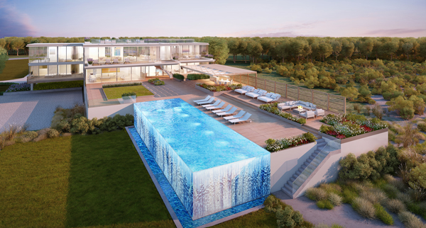
The ultimate luxury is to wake up and open your eyes and see the beach. We wanted to make a house that would kind of disappear, that would let you be outside even if you are inside. And with the technology of sliding structural glass panels, we made that boundary ambiguous.
Outside, it is the same thing. There is an outdoor kitchen, a bar, a hot tub in the pool, a pad of grass and wildflower beds. It’s like you’ve taken everything you’d want in your yard experience and raised it so you can have a view of the ocean.
We wanted the whole thing to be attuned to what is out there. And at the same time have this [impact that would spark a reaction like] “Whoa! What is that all about?”
What about in October? There is a super-cozy den/guest bedroom on the upper floor. It’s tucked behind the living room, so you have this expansive loft-like living room, dining room, kitchen. On the corner, you have the office, and there is a den. I could see myself, or someone, looking at the ocean, maybe the snow is falling, and there is a feeling of a comfort.
Let’s switch gears and talk about city living. What went into your thinking at 75 Kenmare? I have always appreciated how good architecture is a gift to the community. It is something that endures. In the design phase, our client said, “I want you to be proud of this when you walk by in 15 years.”
It’s kind of the ideal New York neighborhood. It’s Soho, East Village, Little Italy and Chinatown. It’s the border of all the most interesting parts of Manhattan touching. There is a lot of energy there.
We wanted something that would have a presence and have an experience whether it was daylight or evening. And that’s what that facade is all about. It’s so highly textured. We did a test mock-up and in the sunlight, it changes completely.
Both 75 Kenmare and the Bridgehampton home are breathtaking from the outside. What is an interior must-have factor that clients ask for? Everybody wants simplicity. They want clean lines. And they want something with a sense of uniqueness. It’s fascinating to me that we can go to a meeting with someone in their 30s or 60s — they may be American or European — and everybody says, “I want to simplify my life. I want less. I want a cleaner place to live.”
 Does that mean adding more closets to hide clutter? No, that means there is a charge on us to make not just a blank wall but something about the wall that you can appreciate. That means we are creating materials that we are thinking through. What is it made out of? How is it made? Who is making it? Why are they making it?
We’ve seen it across multiple projects, even in the design of some accessories we have just launched, there is attention to detail about everything. What it creates for our user, resident, buyer, for the person walking by is a sense of joy and happiness.
That’s what we’re after. We are creating a luxury that is not about marks or trademarks or logos. It’s a luxury that is emotional. It’s a joy that one feels when everything is considered.
What artists inspire your work? We are always referencing our favorite artists. At One Madison Park, we have a bookcase of bronze boxes in a column in the wall. That is us quoting Donald Judd to create storage.
I love James Tyrell. The way he works with light and layers light is hugely important to our work. In an abstract way, it’s why at the beach house the light is so pure. It can permeate the house. You open your eyes and you are looking at a painting.
We are profoundly interested in Sarah Crowner, who makes beautiful Diebenkorn-like compositions but makes them out of things like discarded canvas. We are increasingly interested in process-driven art.
How did you approach the design at One Hudson Yards? Really easily. Related said, “We want something that will not look like anything we’ve ever done. We want something worthy of the address. And show us things we’ve never seen before and, by the way, we’ve seen everything.”
We are an office that is constantly changing and thinking. So we called a metal fabricator. They [have done] all the major casting for Jeff Koons and Ellsworth Kelly. Think of a famous artist and they’ve cast their work.
We built a whole palette around bronze. In the lobby, these colors became colors for the stones and the floor. We pulled the same colors out into the upholstery, even when we created a chandelier. That worked so nicely we just said let’s roll it out through the building.
We took this idea — of luxury being emotional when everything is considered — and we ran it through every possible surface, every amenity, the kitchens, the bathrooms. We took the opportunity to set stone into the faucet handles. We would’ve designed a toilet paper holder if we had time.
Our goal was to make something that would create a contemporary idea of luxury, but one that has its own references and thought processes, so it wouldn’t be, “Oh yeah, that’s so 2000-whatever.” We think it will endure.
The Solomon R. Guggenheim Museum’s restaurant must have been a daunting project. Where did you start? We were like, “How do we tackle this?” We went into the archives, and we found writings of Frank Lloyd Wright, where he was giving his first presentation to the trustees.
He called this geometric shape the primitive initial. It looked kind of like a football, two arcs. If you look at the museum, this becomes the fountain, columns, the plinths. He used this everywhere.
We superimposed different groupings of them at different sizes and have them sort of move throughout. We dropped this diagram on the site and used it as a starting point to bring the energy of Wright, to use his geometry, but in our own way. That let us come into it with a plan and a way to organize the space and seating. Once you find a place to start, you can work on it endlessly.
Is there a signature look that identifies a space of yours? No. It’s not anything we ever wanted to have. And for many reasons. There are so many expressions to study, so many materials to work with. There are so many ways to create space.
People ask: “Are you residential or commercial? Are you architecture or interiors?” Well, we do everything. If you look at Frank Lloyd Wright’s work or Charles and Ray Eames, if you look at a lot of the Europeans from the 1970s … they see design as a way of looking at the world and a way to shape experience. That can be a building or a stool. We embrace that.
So you could design a house and everything inside it, too? We are starting a project in China next month where the house is a historic structure and nothing can happen on the outside, but the inside is up for grabs. They want to conceive of the house as something for them and for the generations after them.
The only thing left to design is clothing. I’ve tried the design-your-own Vans. I don’t think I was very good at it.
This interview has been edited for clarity and space.
