“Swanky” is how Business Insider described Pearl House, Vanbarton Group’s conversion of a 1970s-era FiDi office building into some 600 rental apartments.
“Their latest masterpiece,” wrote the New York Post, which covered the building along with Bloomberg, Curbed, 6sqft, Commercial Observer and the Architect’s Newspaper.
It even featured in a spot on “60 Minutes” and received a visit from Mayor Eric Adams as he promoted his administration’s plans to help owners convert outdated offices into apartments.
It’s not often that a rental building becomes Manhattan’s most buzzed-about development, but 160 Water is getting the kind of attention that’s usually reserved for more remarkable condos. Not since the Frank Gehry-designed 8 Spruce Street pierced the FiDi skyline with its edgy facade and breathtaking views has a rental building quite entered the zeitgeist.
That’s because office-to-resi conversions are still all anyone is talking about in Manhattan real estate as office occupancy, according to Kastle Systems, hovers around 50 percent.
Now that Pearl House has opened its doors, there really is something to say: 2024’s largest conversion is a case study in how renters respond to apartments birthed from big, dark floor plates intended for cubicles.
To see just how the developers did it, we asked #ReTwit’s resident expert on floor plan design: Bobby Fijan — a Philadelphia-based developer who founded a proptech company that optimizes floor plans (he calls it “Moneyball for apartments”) — who demystifies the Internet’s most head-scratching apartment layouts for his nearly 40,000 followers.
Deep units, dark bedrooms and twisting corridors

Pearl House, Fijan said, is a classic case study on the ways a converted office differs from a purpose-built multifamily building.
“The first we see is that these are going to be deep units. That’s just a fact of how it works,” he said. “Deep floor plates are going to have deep units.”
The orientation of a deep apartment as opposed to a long one is the design element that all others spring from.
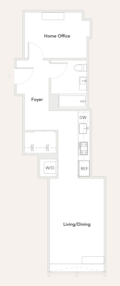
Take, for example, the N line of apartments, which are listed as one-bath studios with a home office for about $4,300 a month. That home office is all the way at the back of the apartment, as far as it can be from the light and air.
It can’t be marketed as a bedroom because New York City code requires all bedrooms to have windows, but Fijan said there’s no doubt in his mind that’s exactly how it will be used.
“I can’t imagine a scenario where someone pays for a small combination dining room and then has a home office in the back,” he said. “Every single person who sees this unit will put their bedroom in this room.”
So instead of a studio with a home office, it’s really a one-bedroom with a dark, windowless bedroom.
Another example of unorthodox layout is the F line, with large corner units listed as two-bedrooms with two-and-a-half baths asking north of $6,500. With walls of big, bright windows letting light pour in from two sides, the place certainly doesn’t suffer from the closet-bedroom syndrome.
But in order to get into the corner of the building, the unit has to twist and turn at right angles. The bathrooms bear the brunt of it.
“This is a very tough layout,” Fijan said. “The master bathroom is nowhere near the master bedroom. You have to walk past the secondary bathroom to get to the master.”
That’s not to say that all the apartments have some sort of identity crisis. The L-line units (legitimate one-bedrooms) would be at home in a building developed specifically for apartments.
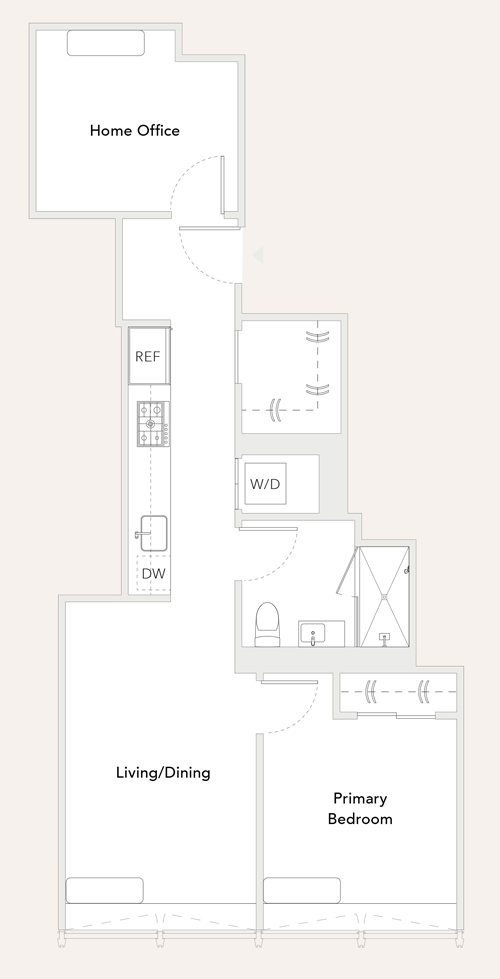
As would the P line, even if the bedrooms in the one-bed-with-an-office apartments are marked as “primary” — which could hint to prospective tenants that the office is large enough to sleep in.
“This is a much more traditional layout,” Fijan said. “3P is actually a very common layout. You walk into the unit past a bathroom into the common and sleeping areas.”
One of the telltale signs that 160 Water is a converted office is not in the apartments themselves, but rather out in the hallways. Most conventional multifamily buildings are built around what’s known as a double-loaded corridor: a straight hallway with apartments on each side.
But at Pearl House, the common interior hallway has to snake its way through twists and turns in order to get into the corner units, which results in wasted floor space that should ideally be rented out as part of an apartment.
“This is not uncommon in a conversion,” Fijan said. “Since the cost is really high, you need to get the highest possible rent per square foot on individual units — which means smaller units, which means more of this loss. Once you go in the direction of that corner, this is the solution you end up with. It results in all these idiosyncrasies you see in the apartments.”
The only game in town now

Of course, the real test of 160 Water is what renters think. And according to Vanbarton Group, it’s been a resounding success.
The market seems to be ready for it. “Leasing is going remarkably well. The velocity outpaces our original aggressive assumptions,” said Vanbarton’s managing partner, Richard Coles.
Pearl House got a temporary certificate of occupancy for the first 200 units in the lower part of the 24-story building and started leasing in December. Tenants have already leased 60 to 65 percent of those units, Coles said.
As for those studios (cough, cough … one-bedrooms) with the dark home offices? Coles said there are plenty of renters who want them, like a nurse who works 12-hour shifts and prefers pitch-black sleeping conditions.
“There are real benefits we find that the consumer goes and says, ‘I want that one.’”
Pearl House has all the amenities you’d expect from a top-of-its-class rental building, including a fitness center, bowling alley, spa and rooftop terrace.
Because of this, Vanbarton considers the building to be in competition with FiDi’s top rentals.
Those include 19 Dutch Street, a 63-story building completed in 2018 by Carmel Partners; 8 Spruce Street — which, at 870 feet, is FiDi’s tallest rental tower and has observatory-worthy views; and 7 Dey Street, a 34-story building built by SL Green in 2021.
“In terms of finishes and amenities and bundling operations, we believe we actually beat all of them on everything, minus 8 Spruce’s views,” said Vanbarton managing director Joey Chilelli.
He said that prices will increase as Vanbarton finishes and starts to list units higher in the building. Penthouse units will go for about $10,000.
Chilelli said the building actually has some advantages over a purpose-built apartment tower. Ceiling heights in the living areas and bedrooms hit 9 feet 6 inches, compared to 9 feet in conventional multifamily buildings, he said.
Another shot in the arm is that Pearl House is the only game in town at the moment. There are no other large, new apartment buildings leasing up in FiDi right now. The neighborhood’s other large office-to-resi conversions — GFP Real Estate/Metro Loft Management’s 25 Water Street and Silverstein Properties/Metro Loft’s 55 Broad Street — won’t be finished for quite some time.
“We hit the market at the right time,” Chilelli said.
