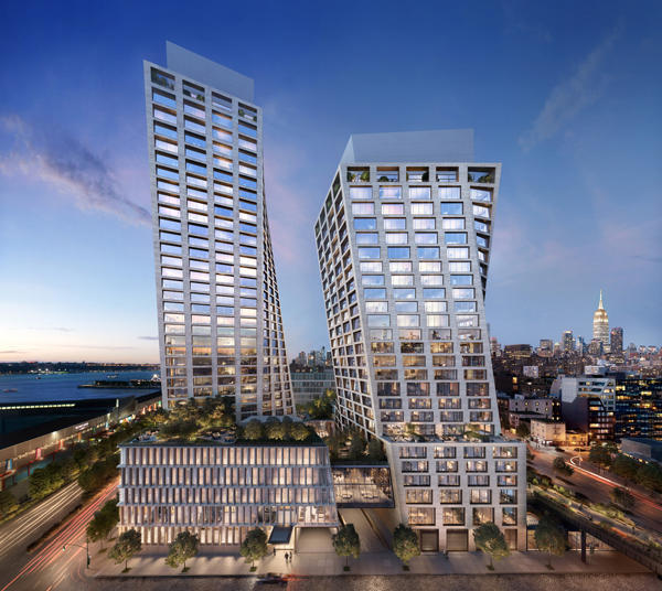
Now it all seems so clear: We live in an age — or at least a season — of tilting and swaying buildings. Three such projects were either recently completed or are now racing toward completion.
The first of these is the American Copper Buildings at 626 First Avenue, twin residential skyscrapers designed by SHoP Architects. Then there are the excellent towers at 10 and 30 Hudson Yards, which were designed by Kohn Pedersen Fox and serve as headquarters to the fashion brand Coach.
And now another pair of buildings is entering the fray: 76 Eleventh Avenue, a mixed-used development dubbed the XI, which was designed by Bjarke Ingels Group and is scheduled for completion in 2019.
This massive project is being developed by HFZ Capital at a reported cost of $1.9 billion. It will occupy most of an irregular block between the Hudson River and the High Line, bounded by Tenth and Eleventh avenues, between West 17th and 18th streets.
The two towers — these swaying structures always seem to come in pairs — will rise to the immediate south of the IAC Building, designed by Frank Gehry.
The west building will rise 402 feet, while its shorter twin will stretch 302 feet. The project will include 236 condos spread between the two buildings — the larger tower will house 149 units and the smaller will include 87, with prices ranging from $2.8 million for one-bedrooms to $25 million for a half-floor penthouse. The project will also include a Six Senses Hotel and commercial space.
HFZ closed on a $1.25 billion construction loan for the project in 2017.
 Like the American Copper Buildings, the two towers will be connected through a skybridge — though much lower down on the structure — dubbed the Bridge Lounge. That lounge will house a fitness center, a 75-foot long swimming pool, a screening room and a library. The building’s interiors are being designed by the New York-based Gabellini Sheppard and by the French firm Gilles & Boissier.
The most striking aspect of the design — as anyone who’s seen a rendering of the project can tell you — is the twisted forms. Those contours are such a departure from the standard cookie-cutter design of most buildings that each window reportedly had to be individually created. Both buildings are pale, their punched windows separated from one another with what looks like limestone infill.
“The geometry of the two towers is a direct response to the context,” Ingels is quoted saying on the project’s website. “As they rise, the towers morph and re-orient to take advantage of the best views at the upper levels, while also allowing for un-obstructed Hudson River views towards the west and city views towards the south, east, and northeast.”
“The twisting geometry at the corners of the towers reduces the overall bulk of the buildings and create additional separation between the towers,” he added.
I am not sure I believe Ingels’ explanation for the design.
It is all too common in architecture to come up with an unconventional design and then rationalize that design later.
Does the fact that these towers shake, rock and roll enhance its views — or create more separation between the towers? By torquing the towers, some views might be enhanced in exactly the degree that others are reduced.
Strikingly, in the context of so unconventional a project, Ingels also makes an historicist case for his design, noting that it “is inspired by the punched windows seen in the historic warehouses of the Meatpacking and West Chelsea neighborhoods.”
He adds that the“facade patterning functions as an honest expression of the gridded structural logic of the building, which steps to follow the movement of the towers’ geometry.”
Ingels seems quite correct about that final point: The exterior does appear to express the underlying structure. And his inspiration is not entirely off the mark.
Most importantly, the results are good. The design has an almost stately presence, without seeming like a stunt to draw attention.
One of the curious things about constructing paired towers is that when they only touch via skybridge, we still understand their relationship to each other. It seems to spring up from the negative space between them.
Just like the sculptures of the English artist Henry Moore, known for his semi-abstract bronze pieces, each is enhanced through its nearness to the other. And in this case, the buildings also frame the Empire State Building and city skyline.
Coach’s Hudson Yards buildings, while very well designed in their own right, display the weakest connection of the three above-mentioned New York City pairs. There the two brooding structures look like robotic invaders hell-bent on conquering Earth.
The American Copper Buildings engage one another with all the energy of a couple on a first date. And at the XI, we have a long-married couple — the combustibility between them is not as intoxicating, but a calm sense of comfort has taken its place. Combine that with river views and you have a successful real estate development.
